A marketing agency I work with brought me in to build four custom landing pages for their client, RM Construction, a high-end home builder and commercial contractor operating across Western Colorado. The pages were designed as destinations for paid and social ad campaigns, with each one targeting a specific service line: commercial construction, commercial remodeling, custom home builds, and luxury home remodels. The agency’s designer had already produced a detailed Figma comp based on the existing buildwithrm.com design language, and my job was to turn that into something that actually lived and functioned inside their Drupal site.
The Setup
RM Construction’s main site was already running Drupal 10 with an established custom theme, so this wasn’t a greenfield build. The goal was to take the designer’s vision and implement it within the existing Drupal environment in a way that was both visually faithful to the Figma file and architecturally sound enough that the agency’s content team could manage and update the pages without developer involvement.
Figma-to-Drupal is a different animal than Figma-to-static-HTML, though, and that distinction matters for how the project was scoped. You can’t just write a one-off template file and drop in the content. The pages need to live inside Drupal’s content architecture so that each section is editable through the admin interface, images can be swapped, copy can be updated for A/B testing, and the whole thing doesn’t require a developer every time the agency wants to tweak a headline. That means custom content types, paragraph types for each section of the layout, and Twig templates that tie the visual design to the structured content underneath.
Building the Section Architecture
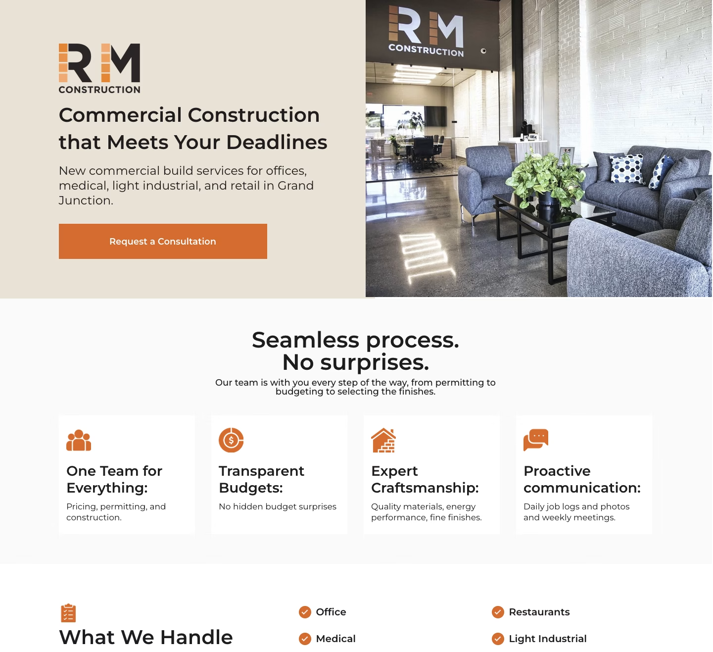
I started by studying the Figma file to map out the section hierarchy, which turned out to be more involved than a typical services page. The designer had built a conversion-focused layout with seven distinct sections, each with its own internal structure: a hero with logo, headline, subtitle, CTA button, and background image; a feature cards row with four icon-and-text pairs highlighting things like transparent budgets and proactive communication; a “What We Handle” section with a categorized service list and a scrollable project photo gallery; a five-step process timeline with numbered icons and descriptions; a service area section with a Mesa County map graphic; a testimonials carousel with star ratings and client photos; and a contact section built around an embedded Buildertrend form.
Each of those sections became its own paragraph type in Drupal, with fields that matched the content the designer intended to be editable. The hero paragraph type, for instance, has fields for the logo, title, subtitle, CTA link text and URL, and the hero image. The feature cards section has a reference field that pulls in individual card paragraph types, each with their own icon, title, and description fields. The process steps work the same way: a parent paragraph that holds an ordered list of step paragraphs, each with a number, icon, title, and description.
The Twig templates for each paragraph type handled the markup and layout to match the Figma comp, using the existing theme as the base so that global styles, typography, and the overall site feel carried through without duplication. The landing pages strip away the standard site navigation (which is typical for ad destinations where you want to eliminate exit paths), but the visual language still reads as RM Construction, not some disconnected microsite.
One piece I didn’t build was the contact form itself. RM Construction uses Buildertrend as their project management platform, and the form on these landing pages is a Buildertrend embed that feeds leads directly into their existing workflow. The agency made that call early in the design phase, and it was the right one; there’s no point in building a native Drupal webform when the client’s team already lives inside Buildertrend and would just need the submissions piped there anyway.
Four Pages, One System
The smart part of the agency’s design approach was that all four landing pages share the same structural template. The commercial construction page and the luxury home remodels page aren’t different layouts; they’re the same set of paragraph types populated with different content, imagery, and messaging. That made my build cleaner and the ongoing maintenance simpler: one set of paragraph types, one set of Twig templates, four nodes in Drupal that the content team can manage independently.
This is the part that actually matters for ad performance. Someone clicking a Google ad for “commercial property construction Grand Junction” lands on a page that speaks directly to that intent, with relevant project photos, commercial-specific copy, and a service area map showing Mesa County coverage. Someone arriving from a social ad about luxury home remodels sees the same professional layout but with entirely different imagery and messaging that matches what the ad promised them. The agency can run tightly targeted campaigns across four different audience segments without sending everyone to a generic services page that tries to be everything to everyone.
All four pages are noindexed, which is standard practice for paid ad landing pages. They exist purely as conversion tools, not as SEO content, and keeping them out of the organic index means the agency has full control over who sees them and through which campaigns.
Working With the Agency
This project was a clean example of how the agency-developer handoff works well when everyone stays in their lane. The agency handled strategy, audience segmentation, and ad creative. Their designer produced a thorough Figma file with clear specifications for every section. I handled the Drupal implementation: content architecture, paragraph types, Twig templates, and styling. There wasn’t a lot of unnecessary back-and-forth because the design deliverable was solid and the scope was well-defined from the start.
The one area where I pushed beyond pure pixel-matching was the content architecture decisions. The designer thinks in terms of visual layout and user flow; I think in terms of how Drupal needs to structure that layout so it’s maintainable over time. Getting the paragraph type granularity right is a real balancing act: too coarse and the content team can’t update individual elements without asking for help, too granular and editing a page feels like assembling a piece of furniture from forty separate components. The structure I landed on gives the agency control over every meaningful content element: headlines, descriptions, images, CTA text, service lists, process steps, testimonials, without making the editing experience feel overwhelming.
Delivery
Four production landing pages running on Drupal, each built on a shared system of custom paragraph types and Twig templates within the existing site theme. The content architecture supports seven distinct section types with nested components, the visual implementation matches the Figma designs, and the editing experience lets the agency update any page’s content, imagery, and messaging through the Drupal admin without touching code. The Buildertrend form integration feeds leads directly into the client’s existing project management workflow, and the pages are configured for their specific purpose as noindexed, navigation-stripped ad destinations optimized for a single conversion goal.
The project reinforced something I keep coming back to: the real value of a landing page build isn’t in the visual design or the markup. It’s in creating a content system that lets the marketing team iterate on messaging, swap imagery for seasonal campaigns, and test different approaches without filing a ticket every time they want to change a headline. When the agency decides to run a new campaign targeting a fifth service line, the paragraph types and templates are already there; they just need to create a new node and populate it. That’s the actual deliverable.